Role
UX Designer | Graphic Designer
UX Designer | Graphic Designer
Client
Northern Health (NH) | Clinical Nurse Educator-HCAP and LTC (NI)
Northern Health (NH) | Clinical Nurse Educator-HCAP and LTC (NI)
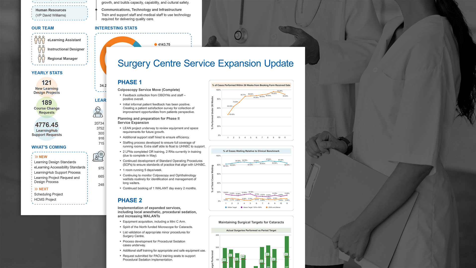
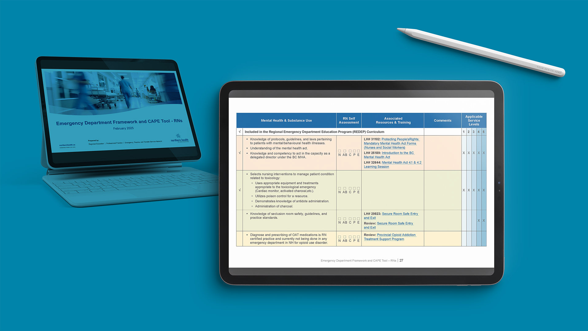
Northern Health (NH) is a major health authority that provides essential services (including hospital care, mental health, and community care) to 26 communities across the vast area of nearly 600,000 square kilometers in northern British Columbia (BC).
Problem
▪︎ Poor Legibility
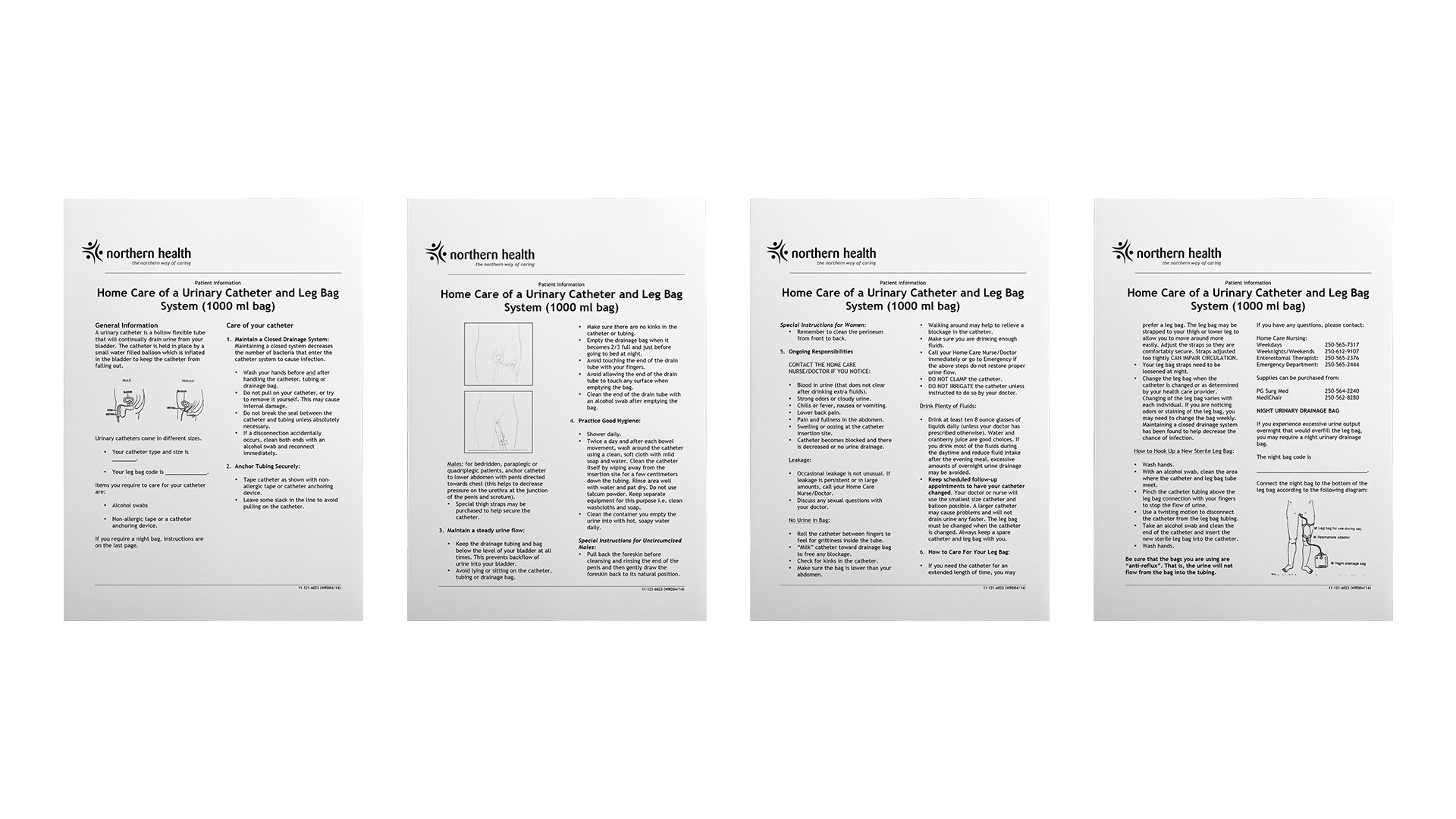
The original document used a standard paper size with a black-and-white palette that lacked visual hierarchy.
The original document used a standard paper size with a black-and-white palette that lacked visual hierarchy.
▪︎ Confusion
Unclear visuals and scattered fillable sections made it difficult for patients to follow instructions or record information accurately.
Unclear visuals and scattered fillable sections made it difficult for patients to follow instructions or record information accurately.
▪︎ Low Engagement
The clinical, cluttered presentation did not encourage patients to keep or refer back to the guide during home recovery.
The clinical, cluttered presentation did not encourage patients to keep or refer back to the guide during home recovery.
Outcome
▪︎ Enhanced Comprehension
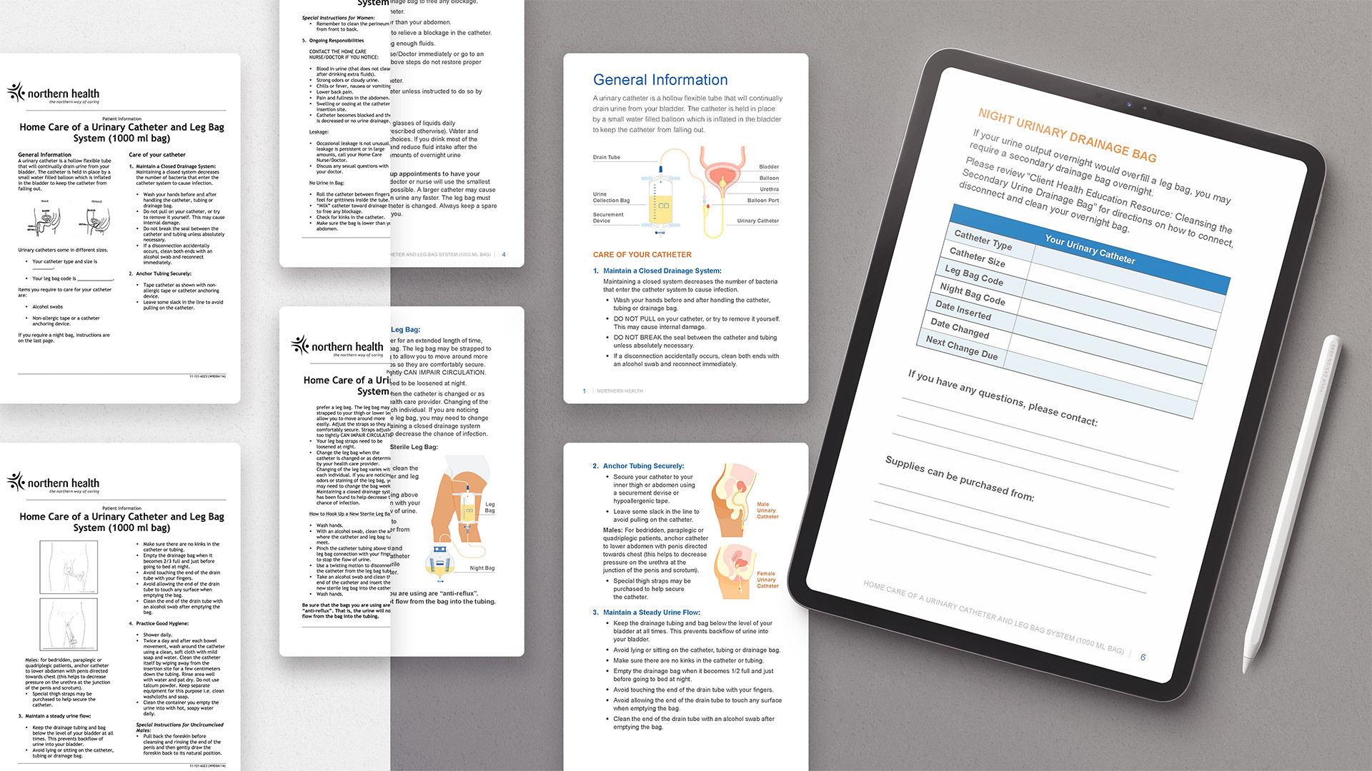
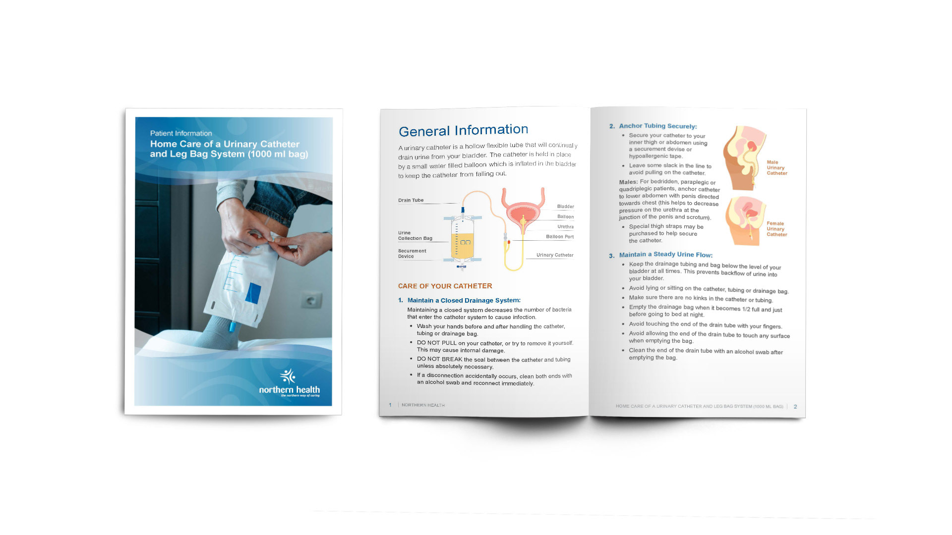
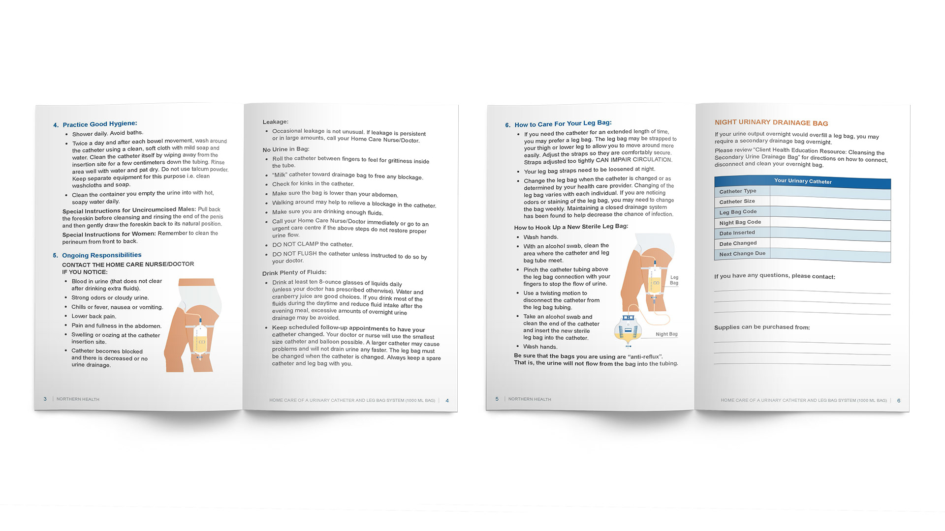
Improved patient usability through clear, step-by-step instructional graphics and a logical flow of information.
Improved patient usability through clear, step-by-step instructional graphics and a logical flow of information.
▪︎ Streamlined Tracking
Consolidated disparate fillable areas into a single, intuitive chart format for easier daily monitoring.
Consolidated disparate fillable areas into a single, intuitive chart format for easier daily monitoring.
▪︎ Elevated Care Perception
The shift to a high-quality booklet format increased the perceived value of care and improved the communication link between healthcare providers and patients.
The shift to a high-quality booklet format increased the perceived value of care and improved the communication link between healthcare providers and patients.
Reflections
▪︎ Design for Accessibility
Working on a medical document reinforced the importance of designing for high-stress environments. I learned that clarity isn't just a stylistic choice, it's a requirement for patient safety.
Working on a medical document reinforced the importance of designing for high-stress environments. I learned that clarity isn't just a stylistic choice, it's a requirement for patient safety.
▪︎ Format
Changing the physical form factor from a flat sheet to a compact booklet significantly changed the user’s relationship with the content, making it feel like a "tool" rather than just a "notice."
Changing the physical form factor from a flat sheet to a compact booklet significantly changed the user’s relationship with the content, making it feel like a "tool" rather than just a "notice."
▪︎ Balancing Function and Aesthetics
Elevating the aesthetic quality of a document directly correlates with a patient's trust in the medical information provided.
Elevating the aesthetic quality of a document directly correlates with a patient's trust in the medical information provided.